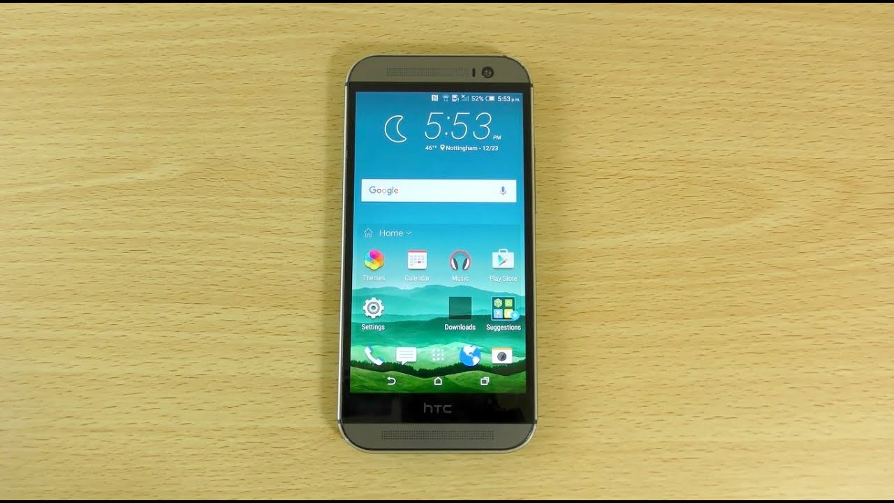
Exclusive HTC One M8 Android 5.0.1 Sense 6.0 Screenshots + Video
Few weeks have passed since last post with Android 5.0 + Sense 6.0 and now the time has come to reveal some new details regarding incoming update. Many of you remember that HTC had big problems on bringing new updates in the past, during last year situation have changed drastically. Now we see almost simultaneous releases for GPE and Nexus devices. Same story for the Sense based devices, Sense users started getting updates few weeks after GPE devices. HTC promised to bring Lollipop sweetness within 90 days on M8 and M7. So now, let take a look what they have done so far…
Last screenshots I posted in my twitter account were made on M8 device, which was running 4.0x ROM based on Android 5.0 (LRX21P), now we have new base. This time I had an opportunity to install 4.1x base running latest Android 5.0.1 (LRX22C) which fixed many nasty bugs. So what do we have now? (Tags were cleaned in terms of safety)
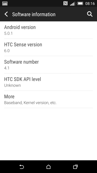
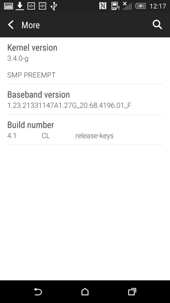
After device start we see notification that we are running test software and HTC will collect all necessary data. I don’t want to be traced! lol 😀 Blinkfeed doesn’t change much, so let go ahead!
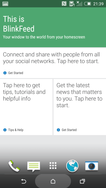
Same situation we have for widgets and the main screen
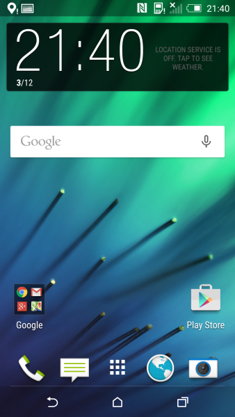
And here we see some new Google apps (Docs, Slides, Sheets), they offer decent office experience. These apps already available over Play market, so you can try these apps right now. You might ask me what the heck they did if nothing have changed? Well, here the answer, some areas were completely reworked, let’s start with notification area
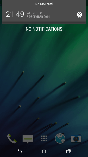
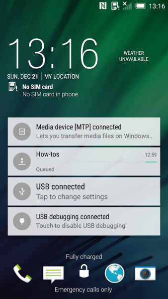
As you can see, new notification area became more “material” and stock looking, which is, in my view, looks really nice! Now all notifications and quick settings are on the same page, so you don’t have make one more click to activate quick settings. Just scroll down and you get them. Notifications also become available on lockscreen.
Another area which got completely new design is a multitasking.
Here the same story as we have in notification area, HTC changed it to stock view, which is nice, but not informative as in the previous version. Highly questionable decision…
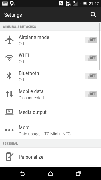
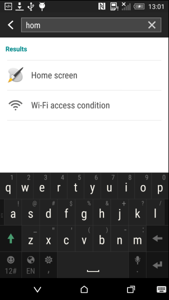
Another nice change can be seen in settings, here we can see search button, which allows to search all available options. Great feature which makes our life much easier in case we don’t know where to find specific feature.
 Beside of that improvements, we are gonna see brand new feature which is called “Easy mode” here how it looks like
I decided to make a short video that shows how it works. Also you may notice how the new notification area and settings search are working. Everything runs fast and smooth, moreover we got latest Android L animations which makes the whole experience even better than it was before
hhh
Another footage here represents new features in Accessibility section, we can see new features called: “Color inversion”, “Color correction” and “High Contrast text”
This is pretty much it. As you can see, it doesn’t bring tons of new features. But it does bring whole experience on the new level. Over 1500 new APIs, ART, Project Volta and other under the hood improvements of Android L gonna make M8 even better than it was.
If you like this article, share it over social buttons below! Stay tuned!


